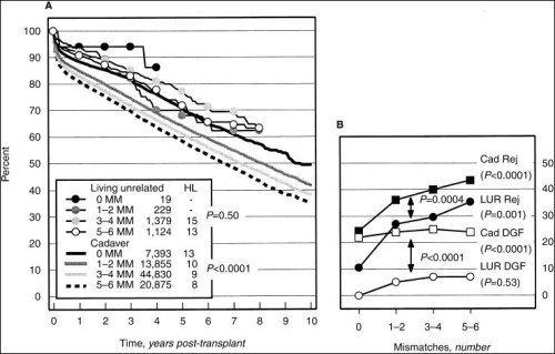
Graphs show up frequently in medical presentations. They usually provide data that is critical to the message of the talk (for example, survival statistics in a presentation on cancer therapy). So how come they are usually so small or blurry as to be unreadable? Let’s look at ways to fix this.
Typical mistakes
The most common mistake presenters make is to cut a complicated graph directly from a relevant journal article and paste it as-is into PowerPoint. Chances are, it’s barely legible in the journal. The axes are probably labeled using tiny print, the lines are differentiated using minute symbols (for which there is a key somewhere near the graph), and there may be a bunch of tiny, explanatory text underneath (or even within) the graph.
If you have to pore over it to understand it when you’re reading the article, it’s not going to be clear or legible in a PowerPoint presentation.
Here’s an example of a PowerPoint slide with illegible graphs:
These three graphs would be unreadable even if they were sharp. The text underneath doesn’t help; it is too small to be legible. When this slide is projected, the audience won’t see a damn thing.
How to do it right
There are only two ways to fix the problem: either find a comparable, legible graph, or create a new graph showing the same data in a PowerPoint-friendly format. It’s usually easier to just make your own graph rather than to look for a pre-made one. It takes a little effort, but the result will be well worth it.
Here’s an example of how I would redo a graph so that it works in PowerPoint. This graph shows how graft survival drops as the number of HLA mismatches goes up. The “after” graph was actually derived from a graph showing slightly different data – but you get the idea.
Before
After
I simplified the “before” graphs by combining them into a single graph and small table. I changed the fonts so that they will be legible from the back of the room, and I used color to draw attention to the main concept behind the graph. I also intentionally left out unnecessary details and clutter.
What you want is for your listeners to get the main point of the graph (they’re not going to remember all the details 10 minutes after your talk anyway). In this case, the main point is that a graft with one or even two HLA-1 mismatches will likely do well, but as soon as you get any HLA-2 mismatches (or if you have mismatches in both HLA-1 and HLA-2 genes), graft survival drops significantly. I used different colors to highlight the different combinations of mismatches so that you can understand the main point by looking quickly at the graph.
You’ll need to judiciously leave out certain details to make your graph readable. This is okay, because in your talk, you’re just going to be explaining the main concepts behind your graph. It’s not necessary (or desirable) to read off every single data point and p value. If you really must give that information to the audience, make a separate handout with a big version of the original graph.
Here are some pointers that will help you simplify data and create a readable graph. Most of these ideas are illustrated by the “before” and “after” graphs above.
- Use a large (at least 24 point) and legible (sans serif) font throughout the slide.
- Use as few data points as possible, and consider using colors (rather than symbols) to differentiate between data lines.
- Remove most of the marks on the x and y axes (leave just enough so that the graph makes sense).
- Simplify the labels of the axes (use plain English and make sure they make sense).
- If there is more than one graph, or if there is tiny text explaining the data, consider moving that information to a small, simple table.
- Don’t list the journal reference in tiny text on the slide. If you need to give that information, do it on the preceding slide using a readable font.
Bottom line
Decide what the single most important point of the graph is, remove all extraneous data, and use big fonts and colors so viewers can get the gist of the graph even from the back of the room.


This series has been very helpful. I felt more comfortable during my last research presentation and people said it was easy to follow. Simplify, simplify, simplify. Thank you!
Thanks, Scott! I’m so glad you found the series useful – I was hoping it would be helpful to someone. It took me a long time to figure this stuff out so I thought I might as well share what I’ve learned the hard way… Congrats on your presentation!!
Thank you! I was thinking about it yesterday, since I will be giving some lectures in the next weeks. I found your website by “accident” and this will be so helpful!!!